A typical workflow using R will likely involve a number of sequential steps from importing the data into the R environment right through to outputting a completed analysis.
An R workflow
The steps involved are not always clearly distinguishable from one another and the format the data starts off in, whether it has been pre-processed, and the required output will dictate the exact steps required and the precise order in which they are performed, though broadly speaking you will be…
Extracting or importing data
Getting the data into the R environment is the first step towards starting an analysis. Data may be retrieved from a database, read from a static file on a local or remote drive, or scraped from the internet, amongst many other options.
Whilst often overlooked in terms of its importance, getting this step right can lay strong foundations for the rest of the project. Taking care to use the most suitable function to accurately and quickly access the data should always be an important consideration.
For more information on reading static files you can check out Reading Data with R.
Performing exploratory analysis
This step involves interacting with the data, identifying its structure, checking for missing data or data quality issues, and generally building an understanding of the data.
Exploratory analysis helps us to avoid nasty surprises during later steps and to choose suitable techniques to build robust, performant, and correct analyses.
Cleansing data
In the real world data is rarely ready to use right away. Datasets may contain extra data that isn’t required, or may contain data items such as postal codes in multiple different formats, or in a format that won’t allow you to join it to another source.
This step can also involve parsing the data, for example rearranging nested data into a flat format or extracting content from a http request. Other common tasks include deduplication, handling missing values, recoding, and steps to improve data quality and accuracy.
Performing analysis
Analysis typically includes adding to the dataset, perhaps calculating summary statistics by groups within the data, adding means, calculating confidence intervals and so on.
This step often involves formatting or manipulating data structures into mediums suitable for presentation or to meet the needs of the end user. It may also include using additional tools and frameworks such as markdown or shiny.
Creating outputs
The final step will typically be to export an output. This might be publishing a shiny dashboard, writing a report or data file to disk, deploying to the cloud, or anything else.
Basic data analysis
Imagine that we have 10 observations recording the number of patients entering a hospital ward each day, and 10 observations of the number of adverse events occurring on each of those 10 days. We can put these 2 sets of observations into a data.frame.
patients <- c(56, 53, 45, 44, 46, 50, 48, 48, 42, 46)
events <- c(11, 12, 11, 12, 4, 12, 15, 13, 9, 14)

df <- data.frame(patients = patients, events = events)

print(df)
#'    patients events
#' 1        56     11
#' 2        53     12
#' 3        45     11
#' 4        44     12
#' 5        46      4
#' 6        50     12
#' 7        48     15
#' 8        48     13
#' 9        42      9
#' 10       46     14
We’re interested in identifying any unusual variation in our data. One way we can approach this is to use a statistical process control methodology. A p-chart would be a suitable way to present the data being both appropriate to the type of data we have and likely familiar to our target audience of health care professionals.
To create the chart we need to calculate:
- the daily proportion of adverse events
- the average proportion of adverse events
- the variation
- an upper control limit
- a lower control limit
Adding columns to a data.frame
We can use the $ operator to access columns in our data.frame, but we can also use it to create a new column. This is as simple as using a name that isn’t already used in the data.frame, for example df$new_column.
To start, lets add an identifier to our observations. As the data.frame already has row names we can capture these using the row.names() function and assign to a column named observation. The data.frame row names are stored as strings, so we can also use the as.numeric() function to create the observation column as a numeric type.
df$observation <- as.numeric(row.names(df))Nesting functions like this allows us to perform multiple operations without having to assign the returns at each step. In this example, as.numeric() evaluates the return of row.names(). There is no limit to the depth to which functions can be nested, but typically code should be written to be readable, so deeply nested code should be used sparingly.
We can create columns for the proportion and average proportion of adverse events named percent_events and average. To get the proportion of adverse events per day we need to divide the number of events by the number of patients for each of the 10 observations.
df$percent_events <- df$events / df$patientsWhen we run df$events / df$patients we are actually performing the divide operation with 2 vectors of equal length. As such, the first element of df$events is divided by the first element of df$patients, then the second element of each, and so on. This operation therefore returns a vector. If we look at our data.frame we can see a value has been calculated individually for each row.
print(df)
#'    patients events observation percent_events
#' 1        56     11           1     0.19642857
#' 2        53     12           2     0.22641509
#' 3        45     11           3     0.24444444
#' 4        44     12           4     0.27272727
#' 5        46      4           5     0.08695652
The syntax to create percent_events is very similar at first glance.
df$average <- sum(df$events) / sum(df$patients)However, sum(df$events) / sum(df$patients) returns a vector of length 1. The difference in behavior is due to the use of the sum() function which means that we only pass one element to each side of the division operator.
You might be wondering at this point how the single element returned by sum(df$events) / sum(df$patients) populates the 10 rows of our data.frame. The answer is that in this instance R ‘recycles’ the single element and uses it in each of our rows.
print(df)
#'    patients events observation percent_events   average
#' 1        56     11           1     0.19642857 0.2364017
#' 2        53     12           2     0.22641509 0.2364017
#' 3        45     11           3     0.24444444 0.2364017
#' 4        44     12           4     0.27272727 0.2364017
#' 5        46      4           5     0.08695652 0.2364017
We can run the code snippets side by side to compare the results.
print(df$events / df$patients)
#' [1] 0.19642857 0.22641509 0.24444444 0.27272727 0.08695652 0.24000000 0.31250000 0.27083333 0.21428571
#' [10] 0.30434783

print(sum(df$events) / sum(df$patients))
#' [1] 0.2364017
The variation calculation is a little more complex.
df$variation <- sqrt(df$average * (1 - df$average) / df$patients)The sqrt function computes the square root of a number, in this instance, the return of df$average * (1 - df$average) / df$patients. Whilst we have 3 vectors here (df$average, 1 - df$average, df$patients) they are all of equal length, so the code returns a vector of the same length when we run it, again the first elements of each vector are processed together, then the second and so on.
Our final task is to calculate the upper and lower control limits.
df$upper_limit <- df$average + 3 * df$variation

df$lower_limit <- df$average - 3 * df$variation

print(df)
#'    patients events observation percent_events   average  variation upper_limit lower_limit
#' 1        56     11           1     0.19642857 0.2364017 0.05677586   0.4067293  0.06607408
#' 2        53     12           2     0.22641509 0.2364017 0.05836061   0.4114835  0.06131984
#' 3        45     11           3     0.24444444 0.2364017 0.06333613   0.4264101  0.04639329
#' 4        44     12           4     0.27272727 0.2364017 0.06405181   0.4285571  0.04424624
#' 5        46      4           5     0.08695652 0.2364017 0.06264391   0.4243334  0.04846995
We now have all the columns we need to create our p-chart, but the formatting isn’t quite right for presentation. Our figures can be converted to a percentage and rounded to make them easier to interpret.
One approach is to round each column individually.
df$percent_events <- round(df$percent_events * 100, 1)
df$average <- round(df$average * 100, 1)
df$variation <- round(df$variation * 100, 1)
df$upper_limit <- round(df$upper_limit * 100, 1)
df$lower_limit <- round(df$lower_limit * 100, 1)
However, this type of approach violates a fundamental programming principle, “Don’t Repeat Yourself (DRY)”. The DRY principle dictates that we should strive to avoid writing the same line of code more than once, and is a fundamental consideration when learning how to write efficient code.
A better approach in this instance is to take advantage of the fact that we want to perform the same operation on each column and they are all of the same type (numeric). With this in mind we can select all of the values simultaneously and apply our function.
df[4:8] <- round(df[4:8] * 100, 1)

print(df)
#'    patients events observation percent_events average variation upper_limit lower_limit
#' 1        56     11           1           19.6    23.6       5.7        40.7         6.6
#' 2        53     12           2           22.6    23.6       5.8        41.1         6.1
#' 3        45     11           3           24.4    23.6       6.3        42.6         4.6
#' 4        44     12           4           27.3    23.6       6.4        42.9         4.4
#' 5        46      4           5            8.7    23.6       6.3        42.4         4.8
Removing columns from a data.frame
Now that we have completed our calculations we don’t actually need to retain the variation column. We can drop the column easily enough by creating a subset of our data.frame.
df <- df[which(names(df) != "variation")]Change a data.frame layout
Our final step is to put our data into a format which we can easily use to create a p-chart. To this end we reduce the number of columns and create additional rows to present the same data.
There are a number of ways to transform a wide data.frame into a longer one, but pivot_longer() from the tidyr package is arguably one of the easier to use. However, being a part of the tidyverse, pivot_longer() returns a tibble rather than a data.frame. Whilst a tibble would work fine, we can keep the data.frame object by wrapping pivot_longer() with as.data.frame().
df <- as.data.frame(
    tidyr::pivot_longer(
        df,
        cols = names(df[4:7]),
        names_to = "measure"
        )
    )

print(df)
#'    patients events observation        measure value
#' 1        56     11           1 percent_events  19.6
#' 2        56     11           1        average  23.6
#' 3        56     11           1    upper_limit  40.7
#' 4        56     11           1    lower_limit   6.6
#' 5        53     12           2 percent_events  22.6
#' 6        53     12           2        average  23.6
#' 7        53     12           2    upper_limit  41.1
#' 8        53     12           2    lower_limit   6.1
#' ...
pivot_longer is an efficient way to reshape data and is simple to use. We pass our data.frame (df) as the first argument, the cols argument allows us to specify which columns we want to transform into a single column, and the optional names_to argument allows us to specify the name of the new single column. The values in the columns we choose will by default go into a column named value, though the name of this column can also be specified with the values_to argument if so desired.
You will notice that we specified the columns programmatically using cols = names(df[4:7]), but cols = c(percent_events, average, upper_limit, lower_limit) would have worked just as well. Being a part of the tidyverse the column names don’t have to be quoted, though doing so doesn’t cause a problem, as demonstrated with the iris dataset below.
identical(
  tidyr::pivot_longer(iris, cols = c(Sepal.Length, Sepal.Width)),
  tidyr::pivot_longer(iris, cols = c("Sepal.Length", "Sepal.Width"))
)
#' TRUE
Tibbles? A tibble, or tbl_df, is a modern reimagining of the data.frame, keeping what time has proven to be effective, and throwing out what is not. Tibbles are data.frames that are lazy and surly: they do less (i.e. they don’t change variable names or types, and don’t do partial matching) and complain more (e.g. when a variable does not exist). This forces you to confront problems earlier, typically leading to cleaner, more expressive code. Tibbles also have an enhanced print() method which makes them easier to use with large datasets containing complex objects.
Plotting the p-chart
Having wrangled our data into the correct format we can now create the p-chart using the ggplot2 package. Don’t worry about the ggplot2 syntax at this point, as it’s a full topic in its own right.
library(ggplot2)

p <- ggplot(df, aes(observation, value, color = measure)) +
        geom_point() +
        geom_line()

p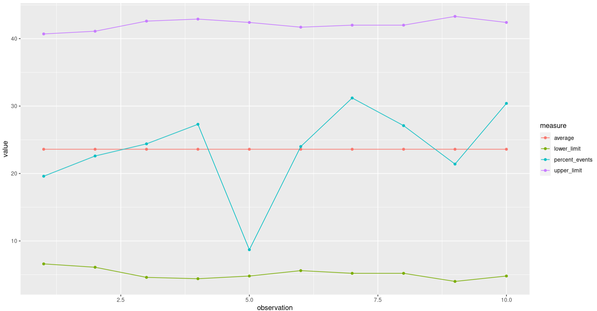
A quick look suggests that we haven’t seen any unexpected variation in our recorded results. Some further work on the chart prior to sharing might include adjusting the colours used, adding titles, and adjusting the axis, but the fundamentals are all there and the underlying data is ready to use.
A tidy approach
The approach above relies mainly upon base R, using the functions included with an R installation by default, and used only one function from an add-on package to process the data.
We can compare the code with a similar approach using the tidyverse.
patients <- c(56, 53, 45, 44, 46, 50, 48, 48, 42, 46)
events <- c(11, 12, 11, 12, 4, 12, 15, 13, 9, 14)

# original code
df <- data.frame(patients = patients, events = events)

df$observation <- as.numeric(row.names(df))

df$percent_events <- df$events / df$patients

df$average <- sum(df$events) / sum(df$patients)

df$variation <- sqrt(df$average * (1 - df$average) / df$patients)

df$upper_limit <- df$average + 3 * df$variation

df$lower_limit <- df$average - 3 * df$variation

df[4:8] <- round(df[4:8] * 100, 1)

df <- df[which(names(df) != "variation")]

df <- as.data.frame(
  tidyr::pivot_longer(
    df,
    cols = names(df[4:7]),
    names_to = "measure"
  )
)

# tidyverse code
library(magrittr)

df <- tidyr::tibble(patients = patients, events = events) %>%
  dplyr::mutate(
    observation = dplyr::row_number(),
    percent_events = events / patients,
    average = sum(events) / sum(patients),
    variation = sqrt(average * (1 - average) / patients),
    upper_limit = average + 3 * variation,
    lower_limit = average - 3 * variation
  ) %>%
  dplyr::mutate(dplyr::across(3:8, function(x) round(x * 100, 1))) %>%
  dplyr::select(-variation) %>%
  tidyr::pivot_longer(cols = 4:7, names_to = "measure")
The tidyverse approach is certainly tidy, we only need to use the assignment operator once, as opposed to 10 times in the original. We can also avoid referencing the data.frame directly (df$) on multiple occasions which assists in keeping the code ‘clean’.
We do need to rely on 3 external packages (magrittr, tidyr, and dplyr) in the tidyverse approach as opposed to 1 (tidyr) in the original, and we need to learn 7 new functions from the tidyverse packages in addition to using 3 more functions in total when using the tidyverse.
This guide attempts to promote learning the base R approach as this allows for building a firm understanding of how the language works itself. As it is aimed to provide an introduction for persons new to R it also attempts to avoid creating an onus to learn multiple packages and functions at an early stage.
Next steps
This guide should have demonstrated some of the most common and useful actions performed whilst processing data and performing a basic analysis. Try the task below to put the demonstrated approaches into practice.
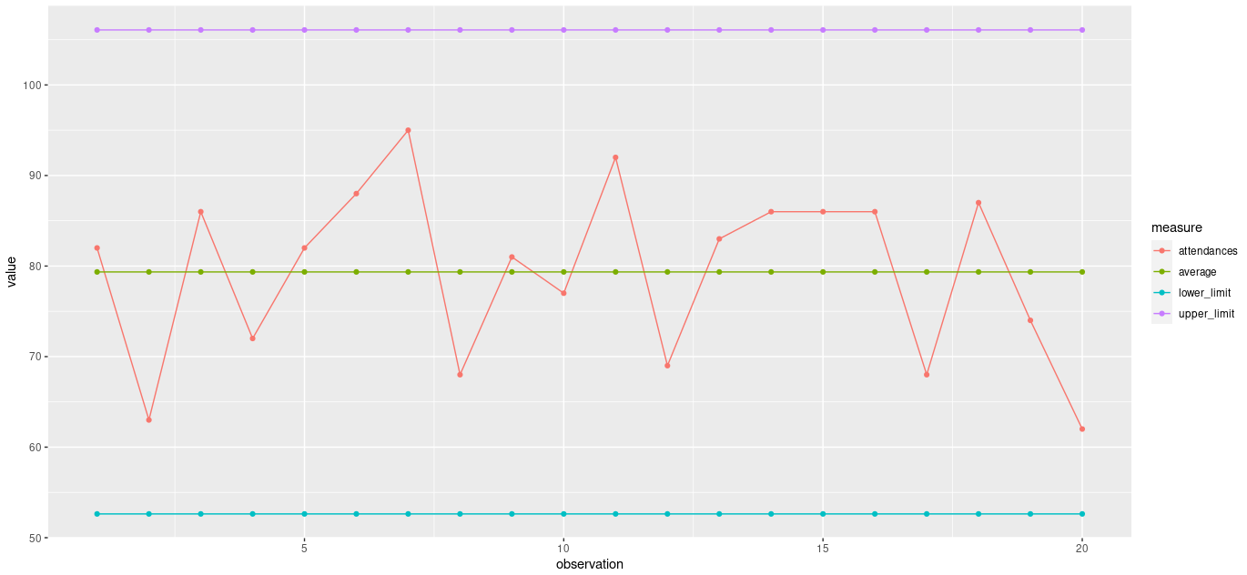
A c-chart can be used when we have count data representing n items in a large, constant, but unknown area of opportunity. The following vector is the number of A&E attendances recorded at a hospital on 20 consecutive Mondays.
c(82,63,86,72,82,88,95,68,81,77,92,69,83,86,86,86,68,87,74,62)To create a c-chart, you will need;
- the number of attendances
- the average number of attendances
- an upper control limit
- a lower control limit
It may be helpful to have an identifier column, for example labelling the observations 1 to 20.
The control limit formulas are;
UPPER: The average number of attendances + 3 * the square root of the average number of attendances.
LOWER: The average number of attendances - 3 * the square root of the average number of attendances.
You should aim to have 5 columns;
- attendances
- observation
- average
- upper_limit
- lower_limit
You can use tidyr::pivot_wider from the tidyr package to transform the data to a long format. The columns to transform will be “attendances”, “average”, “upper_limit”, and “lower_limit”. You made need to install tidyr first, using install.packages("tidyr").
Once happy with your data, try creating the c-chart with the code below. You made need to install ggplot2 first, using install.packages("ggplot2").
library(ggplot2)

ggplot(df, aes(observation, value, color = measure)) +
  geom_point() +
  geom_line()
Answers
Your processed data.frame should look like this;
#'    observation     measure     value
#' 1            1 attendances  82.00000
#' 2            1     average  79.35000
#' 3            1 upper_limit 106.07359
#' 4            1 lower_limit  52.62641
#' 5            2 attendances  63.00000
#' 6            2     average  79.35000
#' 7            2 upper_limit 106.07359
#' 8            2 lower_limit  52.62641
#' 9            3 attendances  86.00000
#' 10           3     average  79.35000
#' 11           3 upper_limit 106.07359
#' 12           3 lower_limit  52.62641
#' 13           4 attendances  72.00000
#' 14           4     average  79.35000
#' 15           4 upper_limit 106.07359
#' 16           4 lower_limit  52.62641
#' 17           5 attendances  82.00000
#' 18           5     average  79.35000
#' 19           5 upper_limit 106.07359
#' 20           5 lower_limit  52.62641
#' 21           6 attendances  88.00000
#' 22           6     average  79.35000
#' 23           6 upper_limit 106.07359
#' 24           6 lower_limit  52.62641
#' 25           7 attendances  95.00000
#' 26           7     average  79.35000
#' 27           7 upper_limit 106.07359
#' 28           7 lower_limit  52.62641
#' 29           8 attendances  68.00000
#' 30           8     average  79.35000
#' 31           8 upper_limit 106.07359
#' 32           8 lower_limit  52.62641
#' 33           9 attendances  81.00000
#' 34           9     average  79.35000
#' 35           9 upper_limit 106.07359
#' 36           9 lower_limit  52.62641
#' 37          10 attendances  77.00000
#' 38          10     average  79.35000
#' 39          10 upper_limit 106.07359
#' 40          10 lower_limit  52.62641
#' 41          11 attendances  92.00000
#' 42          11     average  79.35000
#' 43          11 upper_limit 106.07359
#' 44          11 lower_limit  52.62641
#' 45          12 attendances  69.00000
#' 46          12     average  79.35000
#' 47          12 upper_limit 106.07359
#' 48          12 lower_limit  52.62641
#' 49          13 attendances  83.00000
#' 50          13     average  79.35000
#' 51          13 upper_limit 106.07359
#' 52          13 lower_limit  52.62641
#' 53          14 attendances  86.00000
#' 54          14     average  79.35000
#' 55          14 upper_limit 106.07359
#' 56          14 lower_limit  52.62641
#' 57          15 attendances  86.00000
#' 58          15     average  79.35000
#' 59          15 upper_limit 106.07359
#' 60          15 lower_limit  52.62641
#' 61          16 attendances  86.00000
#' 62          16     average  79.35000
#' 63          16 upper_limit 106.07359
#' 64          16 lower_limit  52.62641
#' 65          17 attendances  68.00000
#' 66          17     average  79.35000
#' 67          17 upper_limit 106.07359
#' 68          17 lower_limit  52.62641
#' 69          18 attendances  87.00000
#' 70          18     average  79.35000
#' 71          18 upper_limit 106.07359
#' 72          18 lower_limit  52.62641
#' 73          19 attendances  74.00000
#' 74          19     average  79.35000
#' 75          19 upper_limit 106.07359
#' 76          19 lower_limit  52.62641
#' 77          20 attendances  62.00000
#' 78          20     average  79.35000
#' 79          20 upper_limit 106.07359
#' 80          20 lower_limit  52.62641
The finished c-chart should look like this;